

03/05/2026
18/12/2025
07/07/2025
Beyond Bézier – Explorations of drawing methods in type design
11/04/2025
14/01/2025
21/11/2023
23/02/2023
NEW: Dear Sir Madam
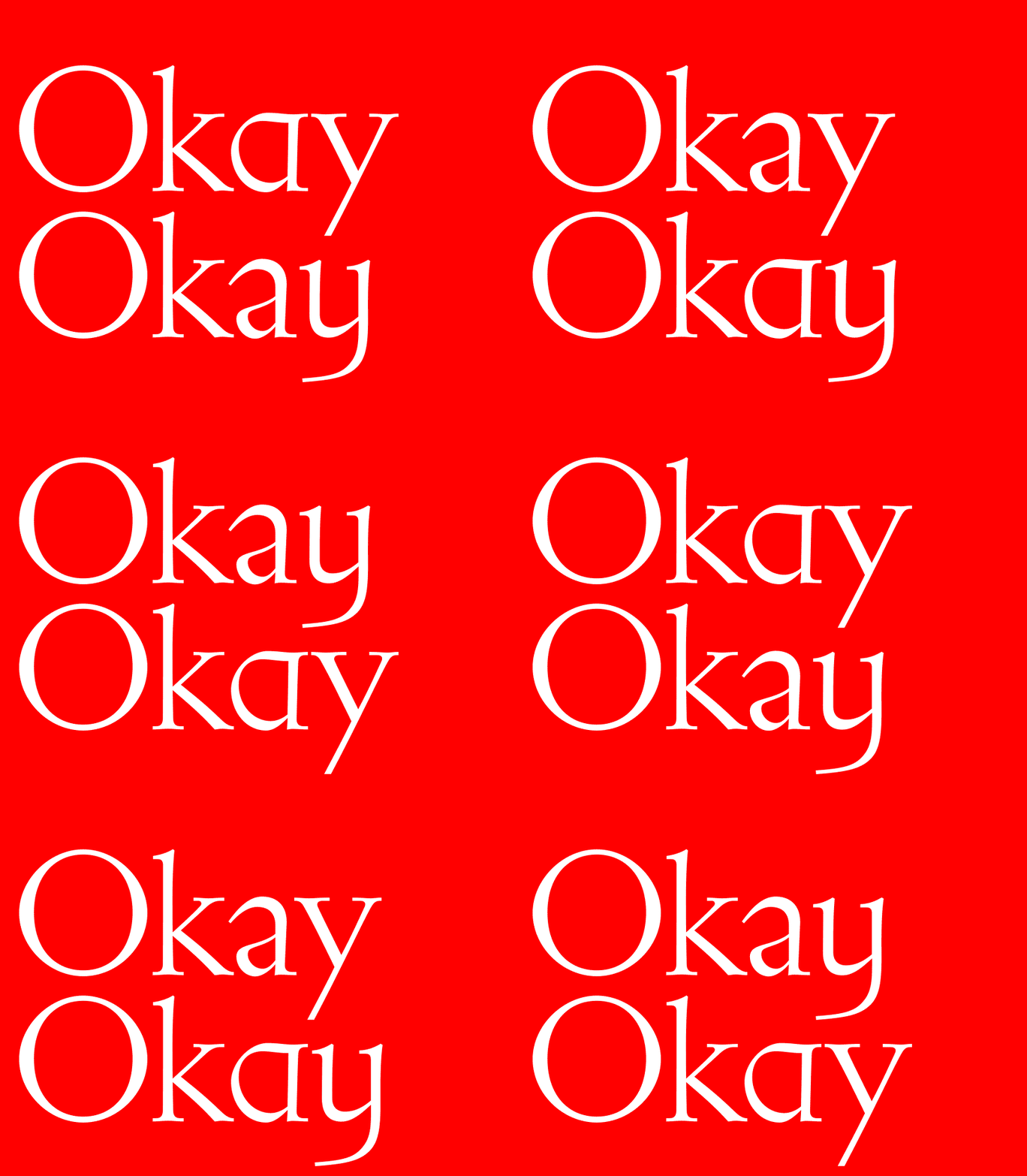
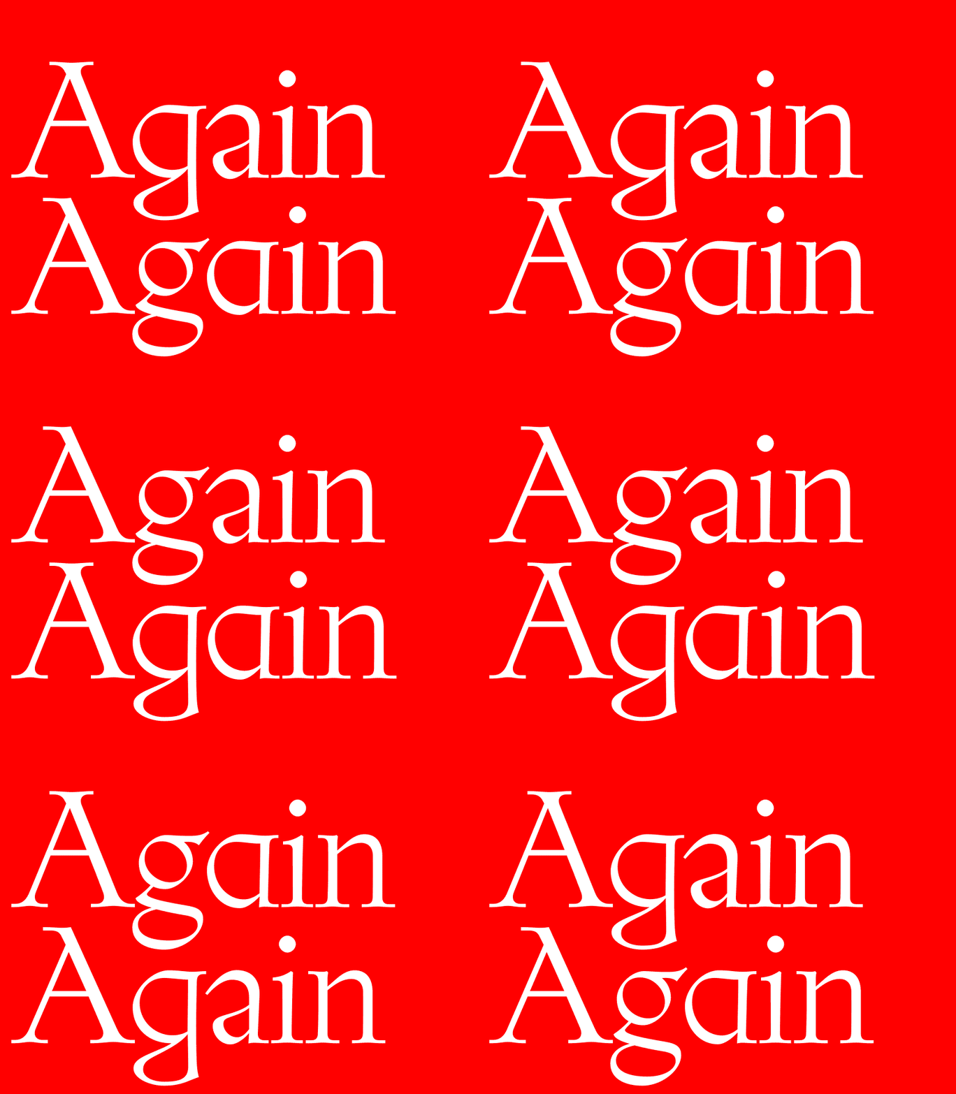
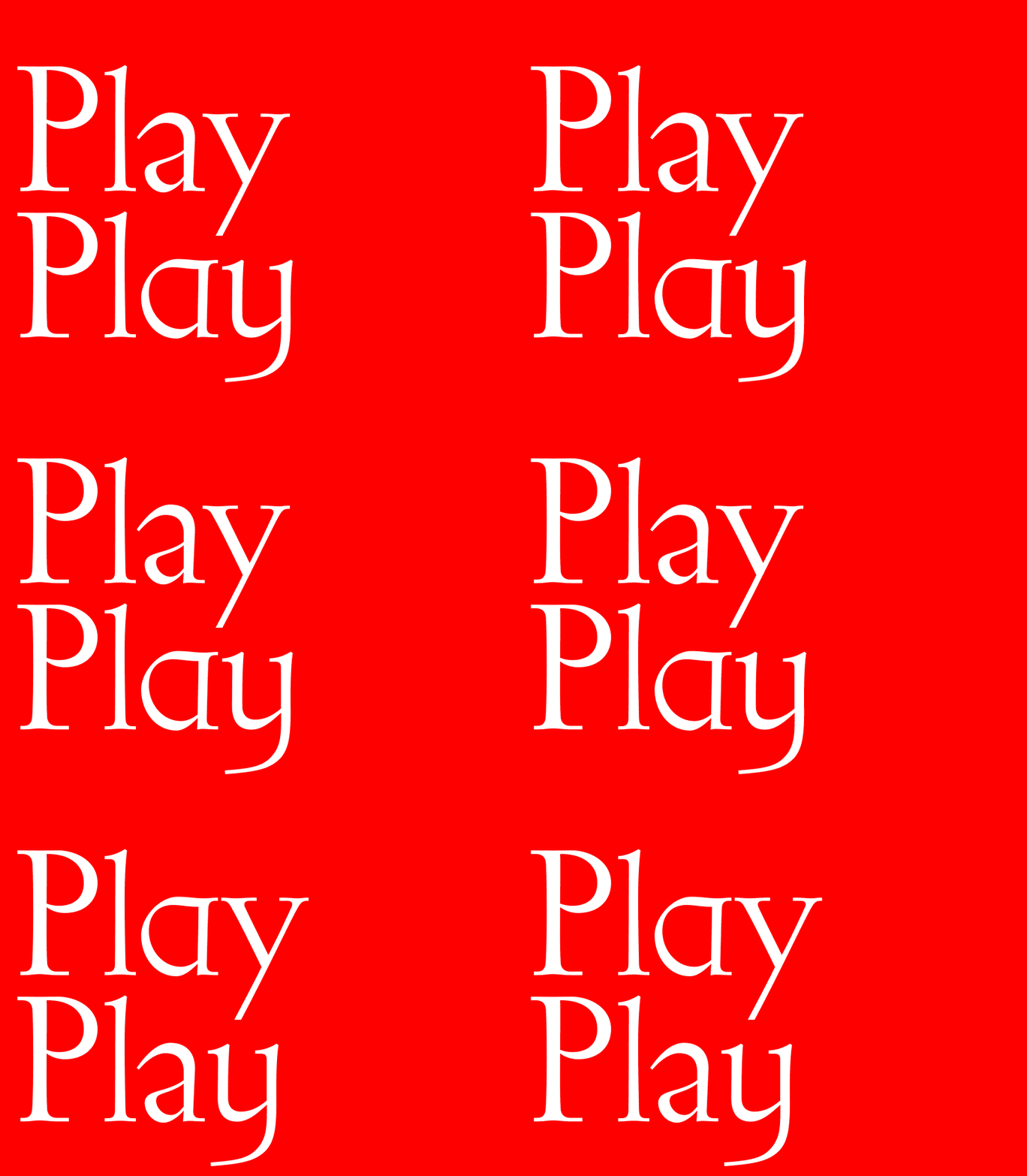
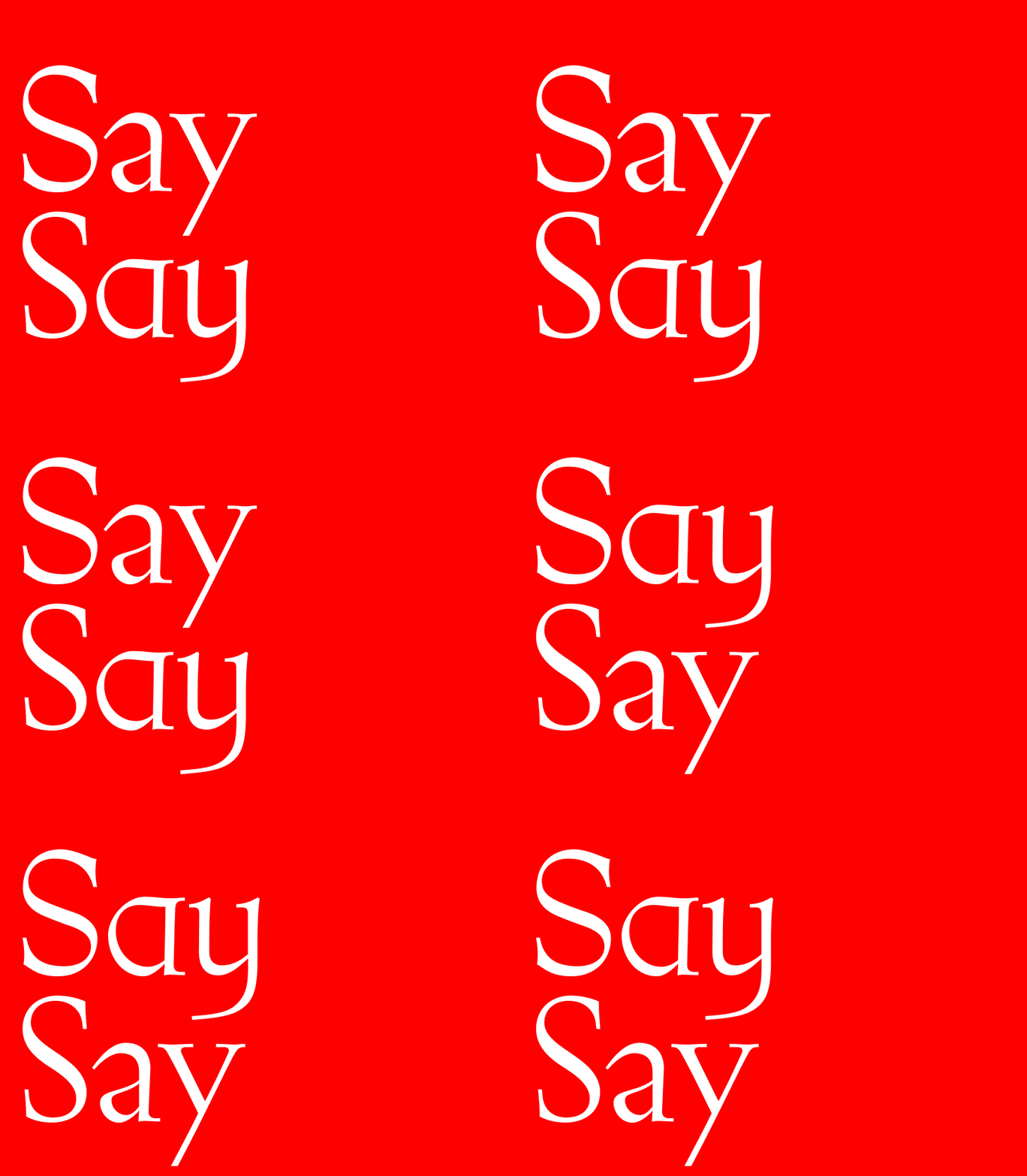
Typeface Dear Sir Madam is ode to classical shapes. Instead of reconciling the inconsistencies, imperfections or mistakes, it embraces them.
Roman and Italic styles with alternates in twelve stylistic sets. Available now.
Conceived as one-off typeface for the exhibition object labels and wall texts, Dear Sir Madam is ode to classical shapes. By reducing the use of straight lines Dear Sir Madam preserves its organic and calligraphic character. Instead of reconciling the inconsistencies, imperfections or mistakes, it embraces them. Originally, the typeface was sent to each contributor to the exhibition* in form of invitation (hence its name) for personal use, limiting its use to the group of collaborators. It is now made available to all.
Dear Sir Madam consists of Roman and Italic styles with alternates in12 stylistic sets. Explore all these alternates in PDF specimen.
*’Zak Kyes Working With’
Keywords: calligraphy, E. M. Catich, Gill’s facia, Johnston’s letters, Roman capitals, two or three signs in London and more
05/08/2022
08/06/2022
01/11/2021
05/07/2021
20/01/2021
15/08/2020
12/05/2020
01/07/2019
04/05/2019
22/11/2018
17/01/2018
10/10/2017
25/11/2016
02/09/2016
16/07/2016
24/01/2016
05/12/2015
03/09/2015
05/01/2015
23/11/2014
26/10/2014
22/10/2014
28/08/2014
10/08/2014
17/06/2014
09/03/2014
26/01/2014
16/09/2013
04/08/2013
08/05/2013
15/04/2013
09/11/2012
06/06/2012
12/03/2012
07/10/2011
01/07/2011
26/04/2011
07/04/2011
14/03/2011
07/02/2011
08/01/2011
15/12/2010
15/10/2010
03/10/2010
16/07/2010
18/05/2010
02/05/2010
24/04/2010
04/04/2010
30/01/2010
05/01/2010