
03/05/2026
18/12/2025
07/07/2025
Beyond Bézier – Explorations of drawing methods in type design
11/04/2025
14/01/2025
21/11/2023
23/02/2023
05/08/2022
08/06/2022
01/11/2021
05/07/2021
20/01/2021
15/08/2020
12/05/2020
01/07/2019
04/05/2019
22/11/2018
17/01/2018
10/10/2017
25/11/2016
02/09/2016
16/07/2016
24/01/2016
05/12/2015
03/09/2015
05/01/2015
23/11/2014
26/10/2014
22/10/2014
28/08/2014
10/08/2014
17/06/2014
09/03/2014
26/01/2014
16/09/2013
04/08/2013
08/05/2013
15/04/2013
09/11/2012
06/06/2012
12/03/2012
07/10/2011
01/07/2011
26/04/2011
07/04/2011
14/03/2011
07/02/2011
08/01/2011
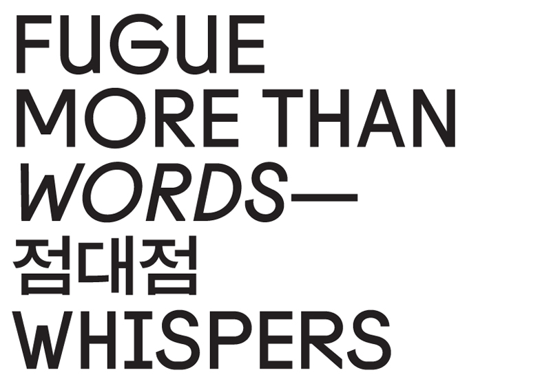
Fugue
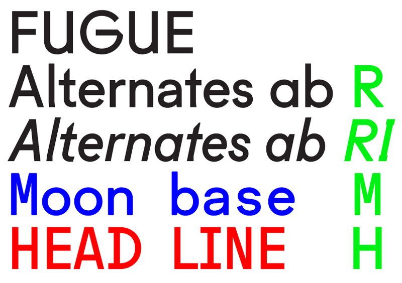
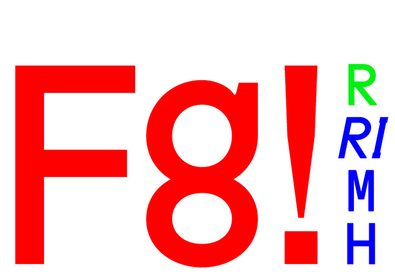
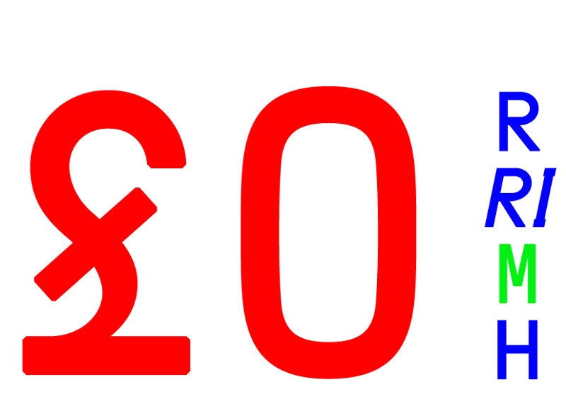
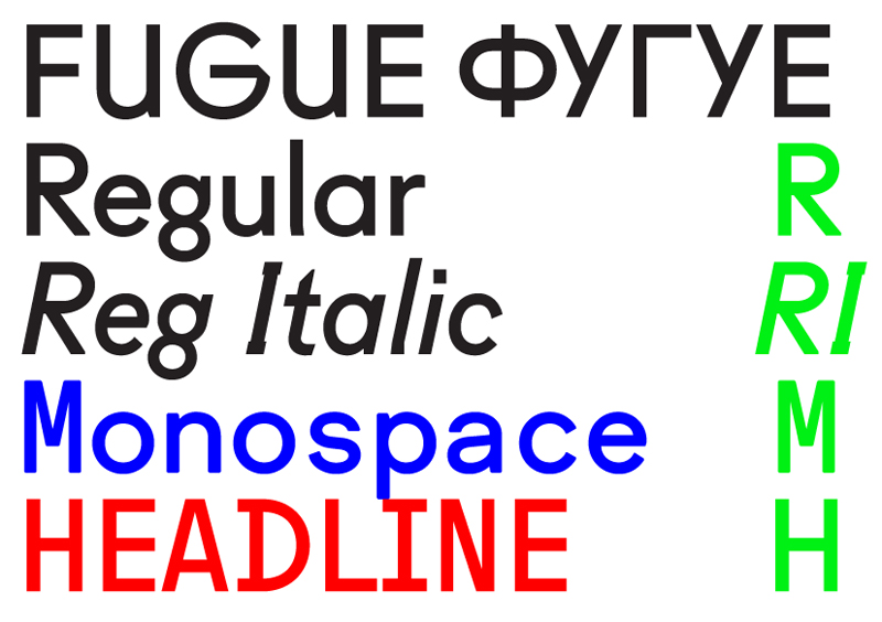
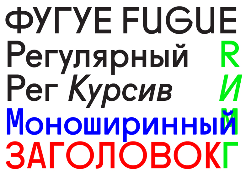
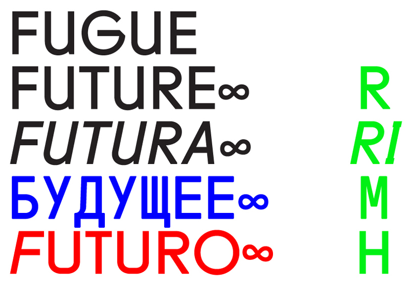
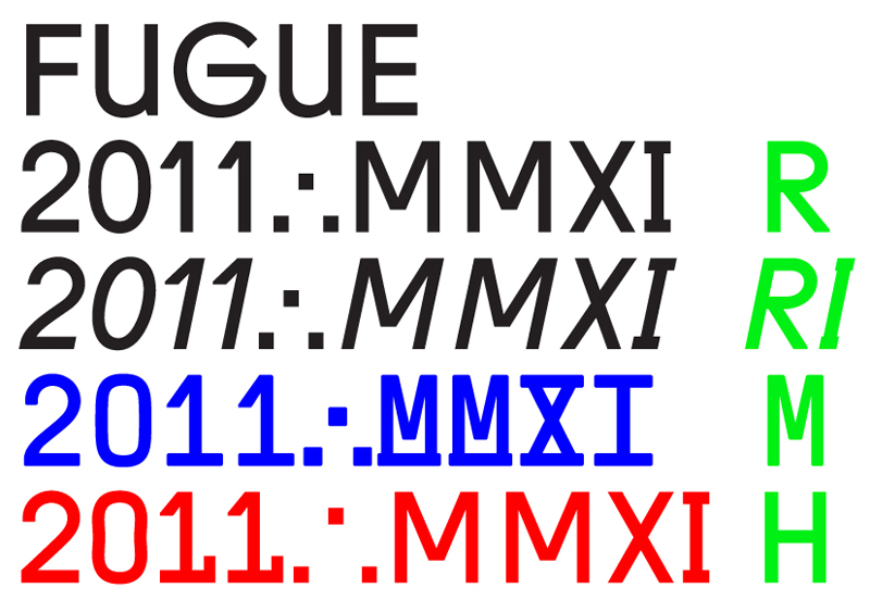
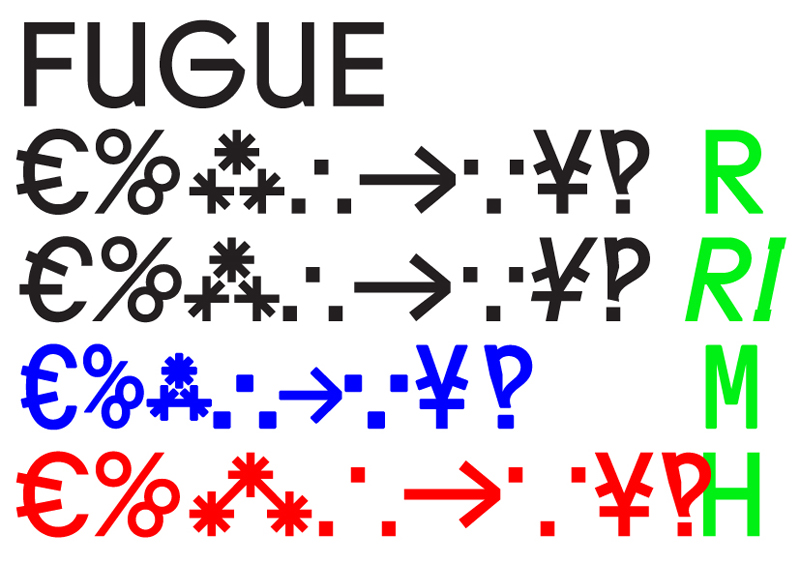
Fugue was first used in ‘Wonder Years’, a book published in late 2008 to mark the tenth anniversary of the Werkplaats Typografie in Arnhem. Redrawn and updated Fugue is now available in Regular, Regular Italic (both in two stylistic sets and with alternates of double-storey ‘a’ and ‘t’ letters among other features), Monospace and Headline.
Fugue (originally designed and used solely in twelve point) was conceived as an appreciation of and going-back-to-the-future-and-back-again with Paul Renner.
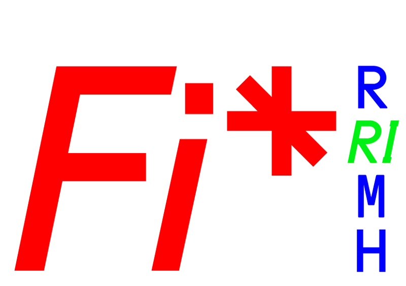
Interfinity mark is now a part of the character set.
Stylistic sets can be used in applications supporting Open Type features.
Explore more in PDF specimen.
Special thanks to Roman Gornitsky (abstrkt.ru).
15/12/2010
15/10/2010
03/10/2010
16/07/2010
18/05/2010
02/05/2010
24/04/2010
04/04/2010
30/01/2010
05/01/2010