- R
- B
- A
- a
- W
-

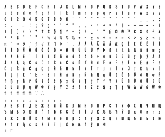
Supported languages:
Albanian, English, Basque, Czech, Danish, Estonian, Finnish, French, Dutch, Croatian, Irish, Hungarian, German, Italian, Lithuanian, Latvian, Norwegian, Polish, Portuguese, Romanian, Slovakian, Slovenian, Serbian, Spanish, Swedish, Turkish + Russian, Ukrainian, Belorussian, Serbian, Macedonian, Bulgarian (containing special Bulgarian characters alternates)
Character set
© RP. For preview purposes only.
Try


