


- R
- I
- A
- a
- W
-
Supported languages:
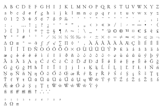
Character set
© RP. For preview purposes only.
Try
Conceived as one-off typeface for the exhibition object labels and wall texts, Dear Sir Madam is ode to classical shapes used as guides for sign-writers. By reducing the use of straight lines Dear Sir Madam preserves its organic and calligraphic character. Instead of reconciling the inconsistencies and mistakes, it embraces them.
Originally, the typeface was sent to each contributor to the exhibition (hence its name) for personal use, limiting its use to the group of collaborators. With Italic style and 12 stylistic alternates added, Dear Sir Madam is now available to all.
Dear Sir Madam is displayed on headlines from Flux rss global.